Glacier Gloss Poster — Villemot's flat poster planes, Sorayama's chrome gloss, and mountain mist
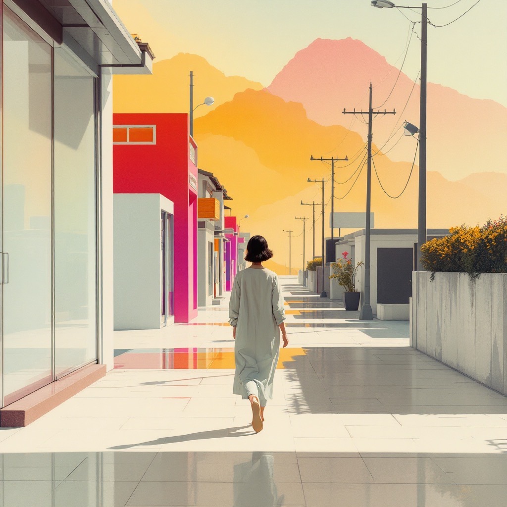
Glacier Gloss Poster plays two kinds of surface against each other: big flat fields of poster colour, and sudden razor-edged highlights that look like wet chrome. Behind both, the distance fades into the pale, silvery mist of an old glass-plate mountain photograph.
The blend
- Bernard Villemot — the flatness. Flat cut-paper colour planes create poster-like graphic economy through unmodulated fills and minimal contour. French poster design at its simplest: solid shapes with almost no outline.
- Hajime Sorayama — the gloss. Airbrushed specular rendering produces liquid hard-edged gloss via masked gradients and mirrored reflections. The mirror-chrome highlights of his robot pin-ups, applied to whatever is in the picture.
- Vittorio Sella's 1906 Ruwenzori expedition plates — the distance. Sella infuses silvery glass-plate tonality with mist-softened recession. Early mountain photography, where each ridge fades a little paler into the haze.
Villemot and Sorayama shouldn't fit together: one flattens everything and the other makes everything shine. The prompt names the collision: "flat-against-glossy contrast". Sella keeps it from turning into pure graphic design by giving it air and depth.
On four models
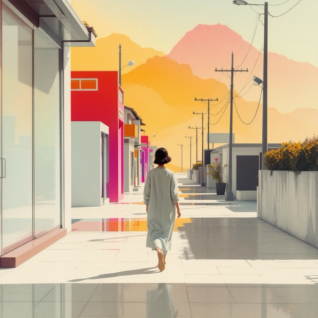
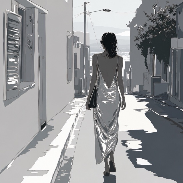
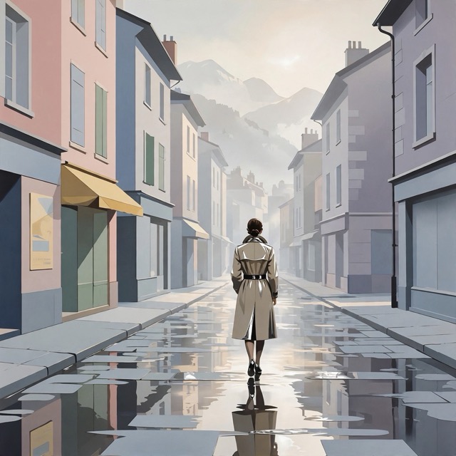
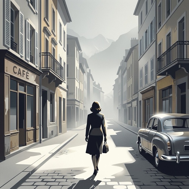
On the usual haiku alone, Flux turned the figure into a giant head in the sky. These renders add "a woman walking away down a quiet, sunlit street, seen from behind".
- Flux 1.1 Pro made the most poster-like version: a white street, flat magenta and red shopfronts, glossy reflections on the paving, and layered pink and gold hills fading behind.
- GPT Image 2 went grey and graphic: flat silver walls, hard-edged white shadows, and a woman in a liquid satin dress that shines like chrome. GPT read "poster" as an invitation to draw an advert with lettering, so this render uses the effect-only text, which names no poster.
- Muse 1.0 made a pastel town with flat facades, a wet reflective road, and pale mountains in the mist at the end of the street.
- Nano Banana 2.1 gave it a period feel: a grey French street with a café and a vintage car, glossy cobbles, and mountains dissolving into haze.
Using it
It suits places with depth and something shiny: streets after rain, cars, glass, water with hills behind. Flux gives the most colour, while GPT gives the most chrome. If a model starts drawing posters with lettering, switch to the effect-only version.
All three are named in the prompt. The model-neutral version uses mid-century French commercial poster art, Japanese chrome airbrush illustration and alpine expedition glass-plate photography.
Tags: Print/Graphic · Poster Art · Pictorialism · Flat Color · Airbrush · Hard-Edge · Specular Highlight