Oxblood Overprint Glow — noir comic inking pulled through a gig-poster press
Everything gets pushed into a few flat ink steps: oxblood and ochre against black, with one cyan note that feels almost electric because there's so little else competing with it. Shadows go hard and graphic, edges catch a thin rim light, and highlights bloom like ink bleeding on toned paper. Up close, the speckled grain and uneven ink density keep it from looking clean or digital.
The blend
- Alex Maleev — the shadows. Photo-referenced noir inking creates dense hard-edged shadow masses that collapse mid-values into a few posterised steps. Big slabs of black, with almost nothing in the middle tones.
- Kevin Tong — the colour. Gig-poster colour separation produces a restricted ochre, oxblood and black ink set with a single saturated cyan note held against it. A handful of inks, each printed flat, plus one accent that does all the work.
- Overprinted screen print on toned stock — the surface. The print process infuses speckled grain and mottled ink density. Where one ink lands on another, and where the coverage thins out, the paper shows through.
Maleev and Tong meet at the same place from two directions: a comic inker throwing away the mid-tones, and a poster printer who only has three or four inks to begin with. Put together, the picture has to be built from flat shapes, and the cyan has to be rationed.
On four models
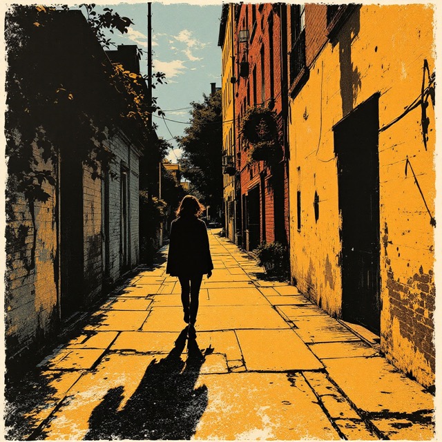
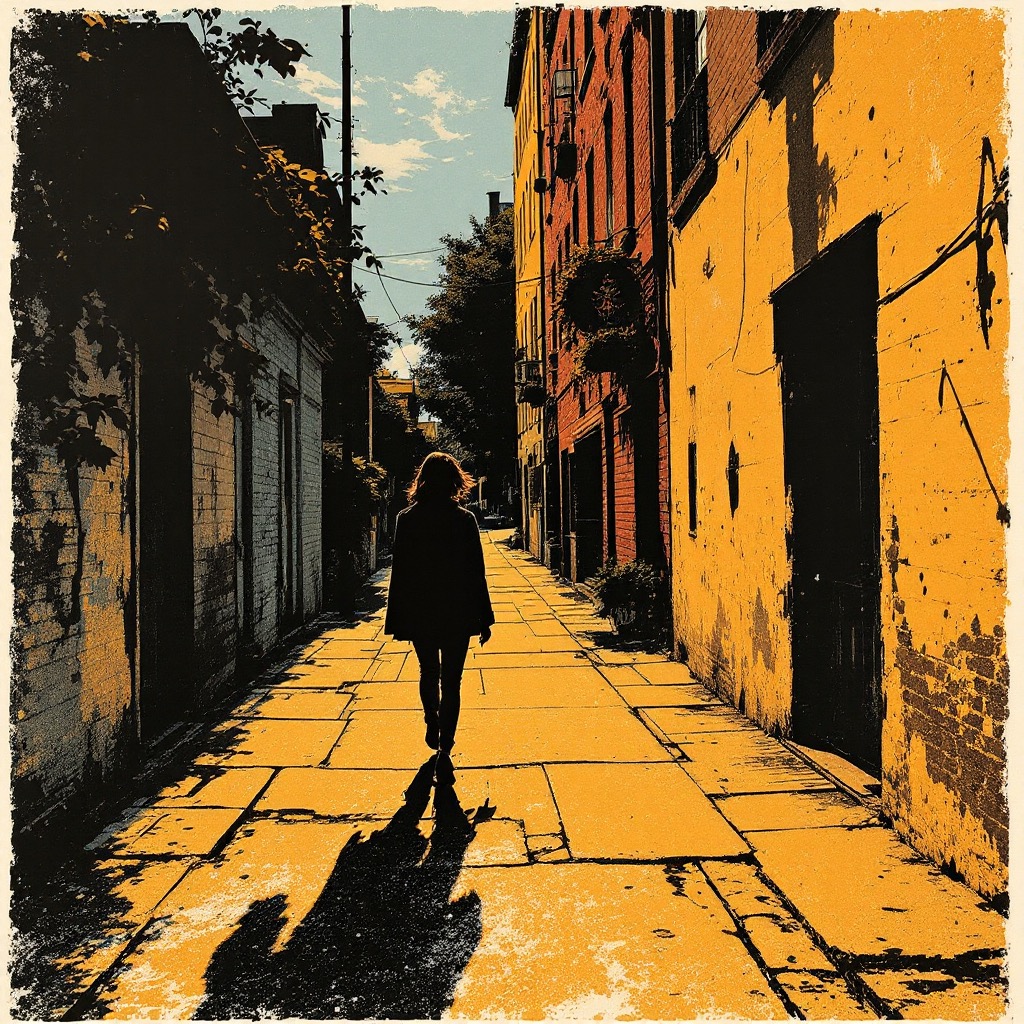
- Flux 1.1 Pro made the plainest print: an ochre street, black walls and shadows, a silhouette walking away, and a speckled, inky texture throughout. There's no cyan at all, so it reads as a two-colour poster.
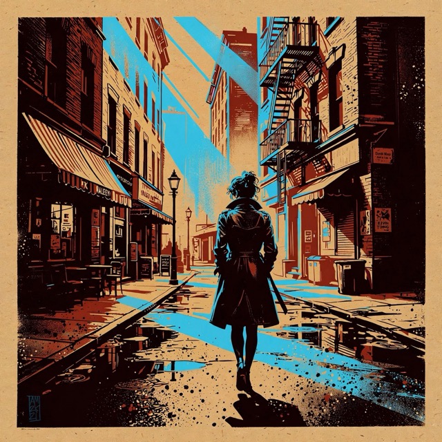
- Muse 1.0 got the whole recipe: oxblood brick, ochre light, black ink, and streaks of bright cyan across the road and in the sky. It's the most gig-poster of the four.
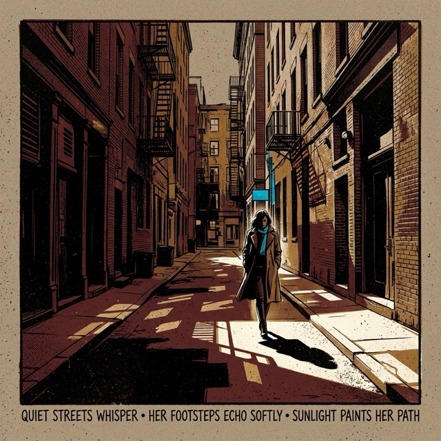
- Nano Banana 2.1 framed the street like a print with a border, with flat oxblood walls and a narrow cyan glint. It also set the collection's haiku as a caption along the bottom.
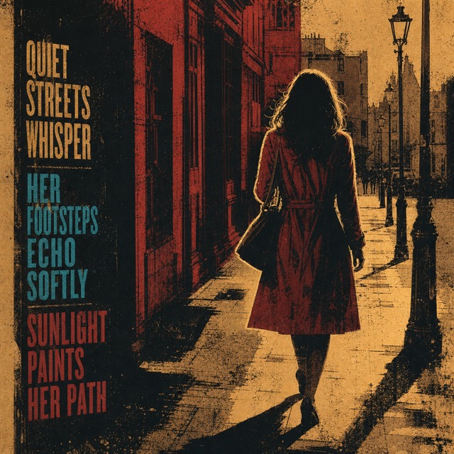
- GPT Image 2 treated it as a literal poster, with the haiku in big stacked type down the left in ochre, cyan and red, beside a woman in a red coat. The type is very much in character for a gig poster, but it isn't what you'd normally want.
Using it
It suits anything with a strong silhouette and a clear light source: a figure against a window, a street at dusk, a face in hard side light. Muse is the one to use if you want the cyan.
The newer models read "poster" as an invitation to add lettering. If they start setting your words as type, swap the subject for a plain description of the scene. The model-neutral version (photo-referenced comic noir inking and gig-poster screenprint colour separation) is there for models that won't take artist names.
Tags: Print/Graphic · Film Noir · Poster Art · Pop Art · Screen Printing · Limited Palette · High Contrast · Flat Color